Skip to content

BRAND GUIDELINES

01Logo02Colours03Typography04Tone of voice05Layout06Photography
Open CraveKitAssets & templates
01 / OUR SIGNATURE

One identity.
Three ways to sign.

Our logo brings the Crave glyph and CraveFX wordmark together. Use the supplied artwork and preserve the relationship between its parts.

CRAVEFX / LOGOExplore logo ↓
White horizontal CraveFX logo
01 — Horizontal / preferred lockup
White stacked CraveFX logo
02 — Vertical / stacked
Black CraveFX glyph
03 — Standalone glyph

Horizontal first

Use the horizontal lockup whenever possible. Keep the glyph and wordmark together in their original proportions.

Stacked for compact formats

Use the vertical lockup for square or circular spaces, such as profile pictures and stamps. Give it enough size to remain legible.

A glyph for limited space

Use the standalone glyph when the complete lockup would become too small. Always use the original files.
THE TWO PARTS

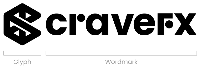
Built to stay together.

Logo diagram identifying the glyph on the left and the CraveFX wordmark on the right
Logo anatomy
CLEAR SPACE & MINIMUM SIZE

A little breathing room.

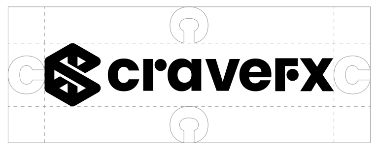
Keep text, imagery and other elements outside the logo’s clear space.

Horizontal logo clear space, measured using the width of the c in the wordmark

Horizontal

Clear space: the width of the “c”.

Digital minimum
100 px
Print minimum
20 mm
Measurements refer to width.
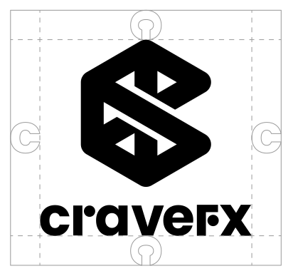
Vertical logo clear space measured using the width of the C

Vertical

Clear space: the width of the “C”.

Digital minimum
70 px
Print minimum
10 mm
Measurements refer to width.
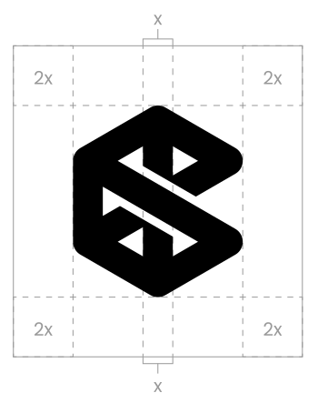
Glyph clear-space diagram; measurement awaits confirmation

Glyph

Clear-space measurement: under review.

Digital minimum
30 px
Print minimum
To confirm
Measurements refer to width.
COLOUR VARIANTS

Keep the signature clear.

The primary variants pair a violet glyph with a black or white wordmark. The monochrome versions work across light and dark compositions.


Primary horizontal and vertical logos: violet glyph with black wordmark on white, and violet glyph with white wordmark on black
Primary colour variants
White logo on near-black
White / Studio dark
Black logo on light grey
Black / Editorial light

Use a black mark on light grey or lilac, and a white mark on near-black or signature violet. Keep enough contrast with the background.

LOGO MISUSEKeep the mark intact.

These are examples of what to avoid. Express the brand through the surrounding composition while preserving the original logo.
Incorrect example: Do not distort the logo.
×Do not distort the logo.
Incorrect example: Do not crop the logo.
×Do not crop the logo.
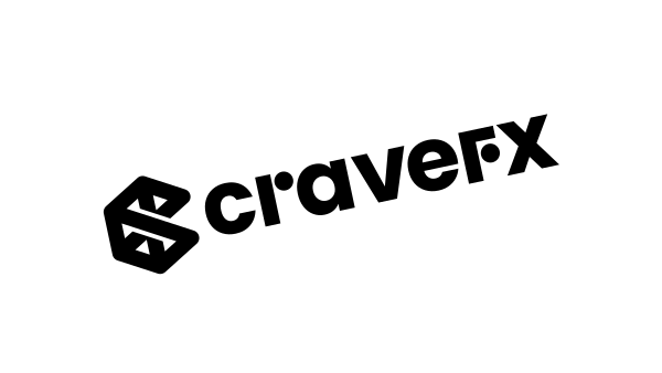
Incorrect example: Do not rotate the logo.
×Do not rotate the logo.
Incorrect example: Do not change its transparency.
×Do not change its transparency.
Incorrect example: Do not add shadows or other effects.
×Do not add shadows or other effects.
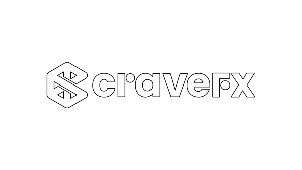
Incorrect example: Do not outline the logo.
×Do not outline the logo.
Incorrect example: Do not manipulate or remove parts of the logo.
×Do not manipulate or remove parts of the logo.
Incorrect example: Do not change the relative size or position of the glyph and wordmark.
×Do not change the relative size or position of the glyph and wordmark.
Incorrect example: Do not recreate the wordmark with another typeface.
×Do not recreate the wordmark with another typeface.
Explore logo assets in CraveKit ↗
NEXT CHAPTERColours→